Accessible colors
What does this mean?
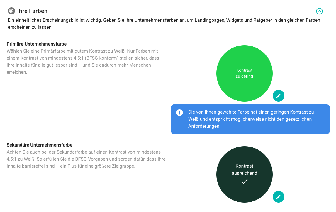
When you select a color in the settings or during onboarding, we check whether this color has sufficient contrast to white.
Sufficient contrast means: The difference between the color and the background is large enough for text and content to be easily recognizable – even for people with visual impairments.
The BFSG Requirement
Sufficient Contrast
The value for sufficient contrast is 4.5:1.
This is a legally recognized standard.
What happens if the contrast is too low?
You will see a corresponding notification and can adjust the colors until they meet the requirements.
💡 Note:
Existing customers are not required to change their color but can adjust it at any time in the corresponding settings.
→ You decide whether to change the color or keep it as is.
An Example
The selected primary color has too little contrast and should be changed. A corresponding notification appears (in blue). The secondary color, on the other hand, has sufficient contrast: